Thursday, October 28, 2010
The making of a new thesis
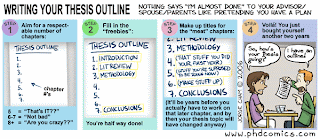
Probably the worst part of going a new direction in your thesis is having to outline and come up with a proposal of something that is going to change 100 times more before you go through your comprehensive exam and get it approved, only to change 50 more times before you actually get near the formal writing of the thesis. So excuse me if I dont take outlining and the proposal with that much gravity. I suppose I should go the way of PhD comics....


Tuesday, October 26, 2010
Informatics*
* information science: the sciences concerned with gathering, manipulating, storing, retrieving, and classifying recorded information
-Wordweb
i.e. wicked cool visuals.
One of my supervisors said something that really stuck with me
"I pretty much write my manuscripts [journal articles] around a few good figures"
If you take a look at typical science article you see 1 or 2 figures, each displaying 5-10 sets of data. Clearly this is quite a task. It's no wonder why making figures takes more time than the actual writing (or it seems -there probably is a sub-thesis social survey there).
So there is the big question: How do I jam as many data sets as possible into journal figures while still making it visually appealing?
Edward Tufte and Informatics attempts to answer this question.
Informatics seems like something apart for science. An afterthought. Some visual designers with all the data at their fingertips and a bunch of fancy proprietary software like tableau and time. So how does the scientist dable in this informatics game? Edward Tufte has the answer:
"Copy the great architects" -Edward Tufte
Here is a cool blog on infographics
Edward Tufte's books, posters and works
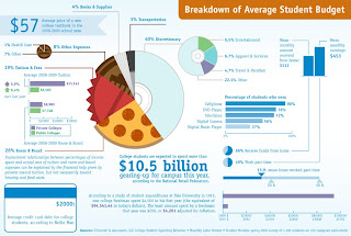
Of course my favorite infographic:
More on visuals in a later post.
-Wordweb
i.e. wicked cool visuals.
One of my supervisors said something that really stuck with me
"I pretty much write my manuscripts [journal articles] around a few good figures"
If you take a look at typical science article you see 1 or 2 figures, each displaying 5-10 sets of data. Clearly this is quite a task. It's no wonder why making figures takes more time than the actual writing (or it seems -there probably is a sub-thesis social survey there).
So there is the big question: How do I jam as many data sets as possible into journal figures while still making it visually appealing?
Edward Tufte and Informatics attempts to answer this question.
Informatics seems like something apart for science. An afterthought. Some visual designers with all the data at their fingertips and a bunch of fancy proprietary software like tableau and time. So how does the scientist dable in this informatics game? Edward Tufte has the answer:
"Copy the great architects" -Edward Tufte
Here is a cool blog on infographics
Edward Tufte's books, posters and works
Of course my favorite infographic:

More on visuals in a later post.
Monday, October 25, 2010
50 REM 100 LCAs
That was a lot of grading. But I did it in one day. 7 pages of poorly cited "scientific" research. Here is my #1 complaint. AMBIGUITY.
ambiguous - having more than one possible meaning; "ambiguous words"; "frustrated by ambiguous instructions, the parents were unable to assemble the toy"
-Wordweb
Here is a list of the most common ambiguous words in the first years writing by category:
Vague Words:
Normally
Generally
Implied Certainty:
Always
Never
All
Every
Comparatives:
Highest
Latest
words ending in "or" or "est"
Words that cannot be qualified:
Efficient
Normal
Faster
Adequate
It was a gold mine......a gold mine of arbitrary
Monday, October 18, 2010
How to use a semicolon
Don't. That used to be my tact on semicolons. Why bother getting it wrong, I will just craft my sentence(s) in a fashion that does not lend itself to the old crotchety punctuation that I only use to make winking smiley faces in texts.
Well that is a pretty ignorant thing to do. My colleagues us "semis" and I always assume they are using them in the correct fashion. To that I say no more! I have ESL colleagues that depend on my to make sure their English is correct. For example:
"The nature of penalty under s.75.21 as a surcharge on stumpage also support absolute liability; there is no defence of due diligence in respect of stumpage payable on the excess volume s.103 of the Forest act."
Is this correct? I need some help.
1. Use a semicolon between closely related independent clauses not joined a coordinating conjunction. When related independent clauses appear in a sentence they should usually be linked together with a coordinating conjunction (and, but, or, nor, for, yet, so). These words signal that there is a relationship between the two clauses. If the clauses are related and if the relationship between them is clear without a conjunction, you can use a semicolon instead.
* I got into an accident; the car was damaged badly.
* I remember the incident well; it happened in 1983.
Semicolons are often used to correct comma splices, which is what happens when we connect two independent clauses with a comma when there is no coordinating conjunction:
* I was late to class today, there was no parking.
This sentence contains a comma splice. While the instinct in correcting comma splices is to use a semicolon here, simply adding a coordinating conjunction would correct the comma splice:
* I was late to class today because there was no parking.
One common mistake is to use words like “however” or “therefore” as coordinating conjunctions. However, they are not. When connecting two independent clauses with a comma and a word like “however” or “therefore,” you can either divide the sentence into two sentences, or use a semicolon, which can be used to connect two independent clauses without a coordinating conjunction.
If you are unsure whether to use a comma or semicolon, check if both sides are independent clauses, or what can stand on their own as sentences. If both sides are independent clauses, you either need a semicolon or a coordinating conjunction. If only one side is an independent clause, and the other is a dependent clauses, use a comma.
If you are unsure whether to use a semicolon or period, think about why you want to join the two ideas together in the first place: should they be in the same sentence or in separate sentences?
2. Use a semicolon between items in a series of items that already contain commas:
* Some of her favorite deserts are chocolate cake, the kind with cherries on top; banana splits, without any nuts; and rice pudding, but only if it is made without raisins.
-University of Maryland
So taking my new-found knowledge I think my colleague was attempting to fix a comma splice with a semicolon. I would change the sentence to read (also correcting the spelling):
"The nature of penalty under s.75.21 as a surcharge on stumpage also support absolute liability because there is no defense of due diligence in respect of stumpage payable on the excess volume s.103 of the Forest Act."
Straight up. Tell me I'm wrong.
ISO 8601
Canada uses ISO 8601 standards for the date. The ISO 8601 date format is an easy date format to understand because it always starts from the biggest number first and then goes down to the smallest number last, year(2009)-month(12)-day(31), and the format always includes the date with a 4-digit year, so it is free from ambiguity.
yyyy-MM-dd (e.g., 2009-12-31)
In the United States, dates are traditionally written in the "month day year" order, that is, in neither descending nor ascending order of significance. (In computing, this would be called a "endianness" order.) This order is used in both the traditional all-numeric date (e.g., "12/31/99" or "12/31/1999") (said with all cardinal numbers) as well as in the expanded form (e.g., "December 31, 1999") (usually said with the year as a cardinal number and the day as an ordinal number; e.g., "December thirty-first, nineteen ninety-nine"), with the historical rationale that it is indeed big-endian with respect to the month and day, as the year was often of lesser importance. The most commonly used separator in the all-numeric form is the slash, although the hyphen is also common. Dots have also emerged in the all-numeric format recently due to globalization.
MM-dd-yyyy. (eg. 12/31/1999)
-Wikipedia
Sunday, October 17, 2010
What are Fuzzy Charts?
Fuzzy charts are things like pie charts or Wordles that are visually appealing but actually do not convey data properly or provide a good medium for analysis.
"Some of the most confusing new visualizations are the popular network diagrams, which are intended to show connections between nodes and invite inferences about the forces that govern the connections. Numerous groups have produced maps of social networks, internet traffic, and other complicated phenomena, but the impression one gets is merely of connectivity, rather than of any of the patterns the visualization purports to convey. Few obey the principles of perception-informed design or Edward Tufte’s rules for graphical integrity, which state that graphics should make viewers think about the subject matter, not design."
--Greenwood from SEED magazine in the article "Getting Past the Pie Chart", February 18th, 2009.
This is odd, as making networks is what how our brain functions and to make those networks spatially appealing is how we discovered the brain worked in the first place. The brain has 100 billion neurons with over a trillion connections. It has been said that emotion and thought are born here [the neurons of the brain], ie. the neuron connections in the brain is what makes us human. However, saying that displaying data similar to how our brain physically works is a jump in logic that is quite flawed. The reasoning mind is simply a set of binary code or switches. Feelings we value are another story. But our mind must interpret visual data in a hierarchical (computational) format. That is why we value bar graphs and lists to break apart or analyze data. The more we can stick to the latter types of data visualizations the less our brains will have to work on transforming the data from a confusing pie chart to a hierarchical list, thereby leaving time for emotion and creative thought and not get tripped up or worried that we are reading the data wrong.
-More on Edward Tufte's rules for graphical integrity in a later post
-More on Psychology (study of ourselves(mind)) and creativity in a later post
Back to emotions and who we are bring us to a man I very much admire, Alan Turing. The Turing test is build a computer that could chat to a human and have the human not know that you were in fact talking to a computer. Alan thought we have this accomplished by the year 2000. He was wrong. The turing test shows that are brains are not entirely a set of binary code and no computer can match our intelligence. Either because something else is a driving force behind what we do and/or we have emotion (ie. we are irrational).
-More on B.F. Skinner and Behavioralism in a later post.
-More on Alan Turing (esp. the chaos theory) in a later post.
Overall, in terms of data visualization the simplest and most hierarchical are the best. When it comes time to analyze that data in your writing, it is best to leave emotion (as defined in this post) to the discussion. Following this logic, the IMRDC format is actually quite spot on. Something I have grappled with for years.
Quick notes for data visualizations:
NO
-pie charts
-networks
-wordles, or idea clouds
-colors unless needed to recognize a specific pattern
-unnecessary arrangements
YES
-simplicity
-interactiveness
-few colors
Saturday, October 9, 2010
(cf. Murphy and Bloom 1990)
cf in citation means that you must consult the item at which the abbreviation is directing you. The "cf." is a shortening of the Latin "confer," which means "consult" or "compare." The mark will usually come before a citation; when it does, refer to that citation for more information.
-Oxford Dictionary
-Oxford Dictionary
Thursday, October 7, 2010
Its versus It's
Easy
It's is a contraction for it is.
Its is a possessive pronoun.
Thanks: http://garyes.stormloader.com/its.html
It's is a contraction for it is.
Its is a possessive pronoun.
Thanks: http://garyes.stormloader.com/its.html
Subscribe to:
Comments (Atom)